The Emerging AI Tool Interface Standard: A New Design Paradigm
The AI tool ecosystem is rapidly converging on a unified interface design that's becoming the standard across platforms like OpenAI's ChatGPT, Claude, Replit Agent, Google's Veo, and numerous other AI-powered applications. This isn't coincidence—it's the emergence of a purpose-built design language optimized for human-AI collaboration.
The Core Architecture
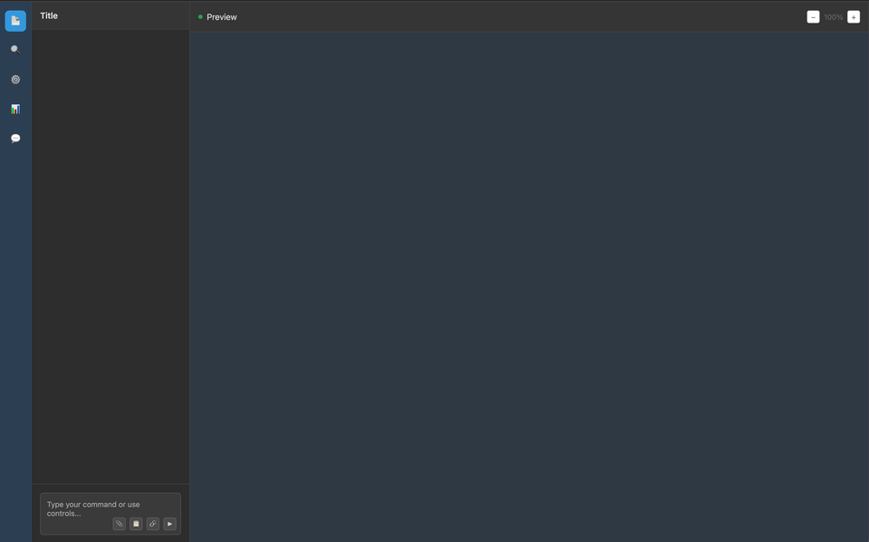
Left-Heavy Navigation
- Thick left sidebar serves as the primary navigation hub
- Minimalist icon system replacing traditional text-heavy menus
- Collapsible panels that prioritize screen real estate for the main workspace
- Session/project management housed in this left column
Minimal Top Navigation
- Drastically reduced top bars or complete elimination
- Essential controls only (settings, user profile, core actions)
- Flat design hierarchy that doesn't compete with the main workspace
Prompt-Centric Bottom Interface
- Dedicated prompt input area as the primary interaction point
- Integrated tool palette directly adjacent to or within the prompt area
- Quick access controls for common actions (upload, voice, formatting)
- Contextual suggestions and shortcuts
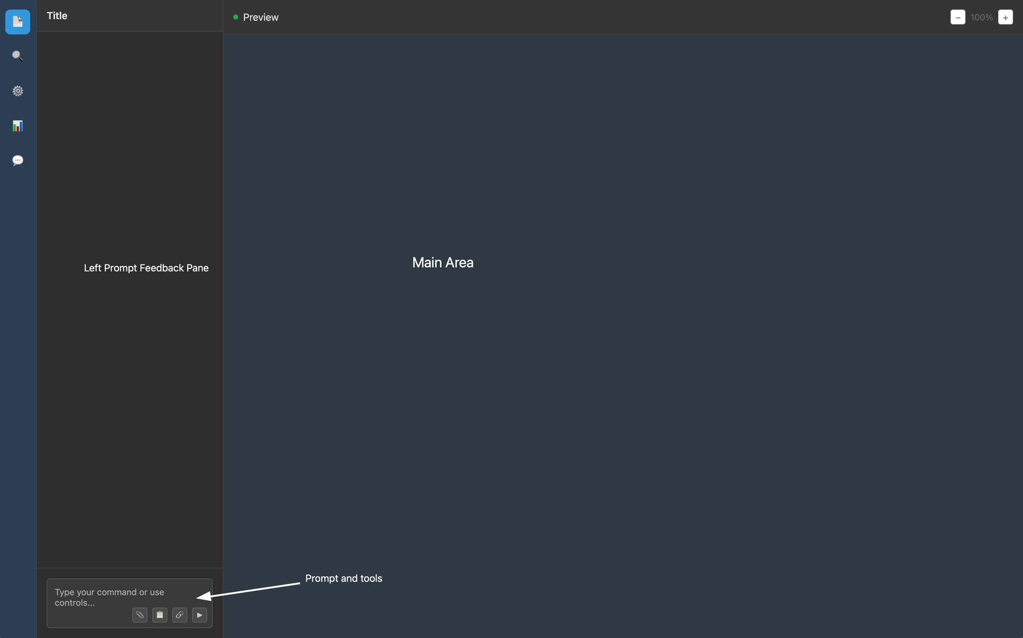
The Three-Zone Layout Philosophy
Zone 1: Control & Context (Left)
The left pane serves as mission control—housing conversation history, project files, settings, and navigation. It's always accessible but can be minimized to maximize workspace.
Zone 2: Interaction (Bottom)
The prompt area isn't just an input field—it's the command center. Modern AI interfaces are treating this as the most important real estate, often with expandable areas for complex prompts and integrated tool access.
Zone 3: Output & Preview (Center/Right)
The main workspace displays AI responses, previews, and working documents. This area is optimized for readability and interaction with AI-generated content.
Why This Design Works for AI
Conversation-First Mindset
Unlike traditional software that's task-oriented, AI tools are conversation-oriented. The interface reflects this by making the prompt the primary interaction method, not buried in menus.
Context Persistence
The left sidebar pattern allows users to maintain context across sessions while keeping the main workspace clean. Users can reference previous conversations or projects without losing their current flow.
Progressive Disclosure
The collapsible nature of these interfaces means complexity is hidden by default but accessible when needed. Novice users see a clean prompt box; advanced users can expand tool panels and options.
Dark Mode Dominance
Nearly universal adoption of dark themes reflects the "professional tool" positioning of AI applications and reduces eye strain during extended creative sessions.
UI Size / Font Size
For some reason the font sizes and icon sizes are smaller than a typical pre-AI interface (think google docs, or any typical website-app). I think this could be due to otpimisaing the space, but my feeling is this has more to do with who is building or using these tools ie folks with better eye sight (20-30 year old demographic). I have no citation for this, just a hunch.
Evidence Across Platforms
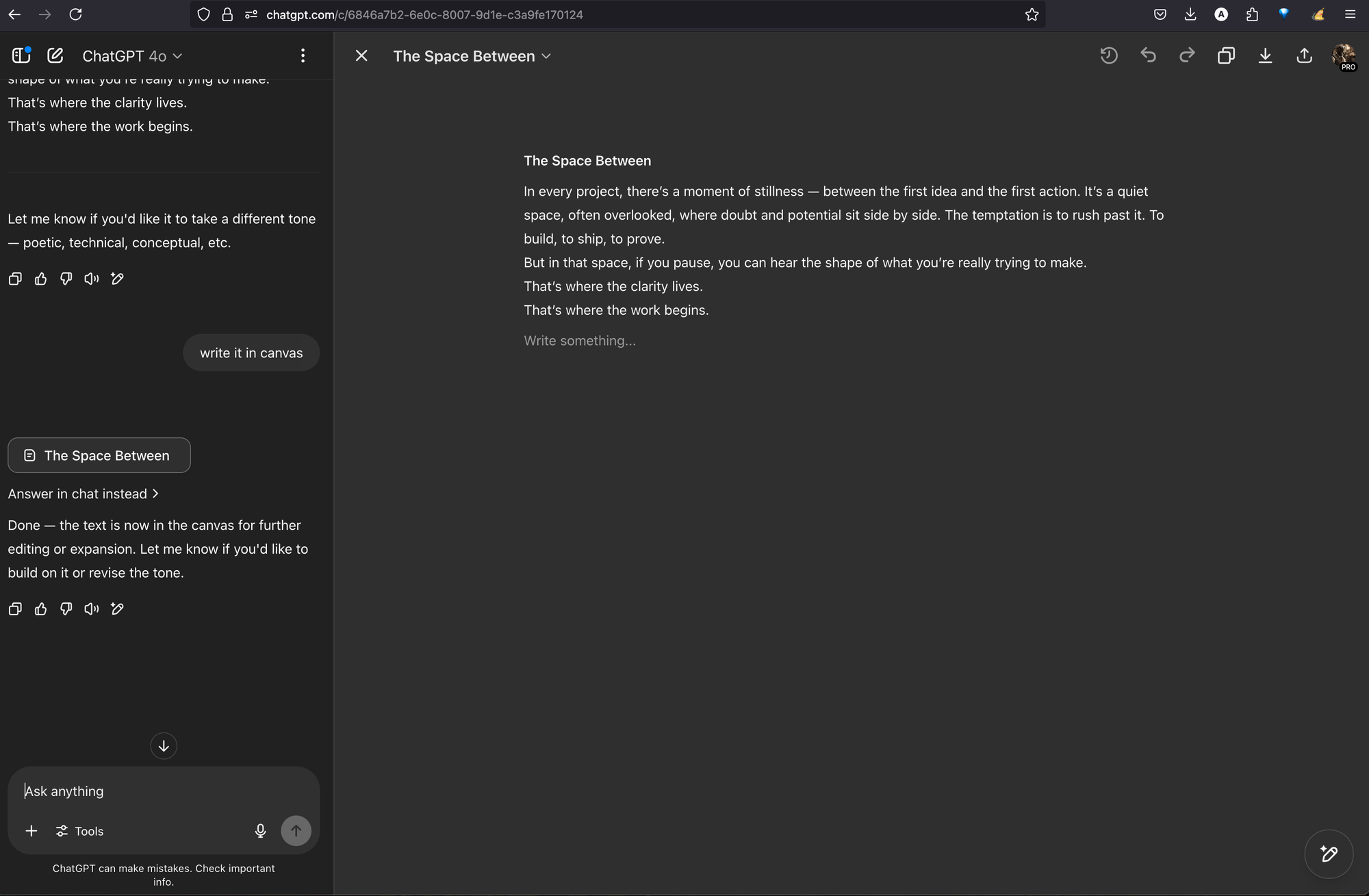
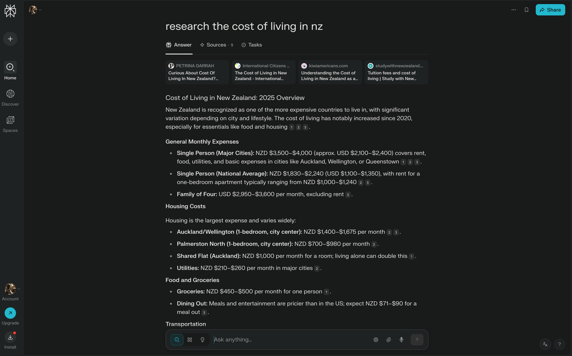
OpenAI ChatGPT: Thick left sidebar for conversations, minimal top bar, prominent bottom prompt with tool integration.
Claude: Similar left-heavy navigation, clean main area, integrated prompt and tool access
Replit Agent: Code-focused but follows the same pattern—left project navigation, central workspace, bottom command interface
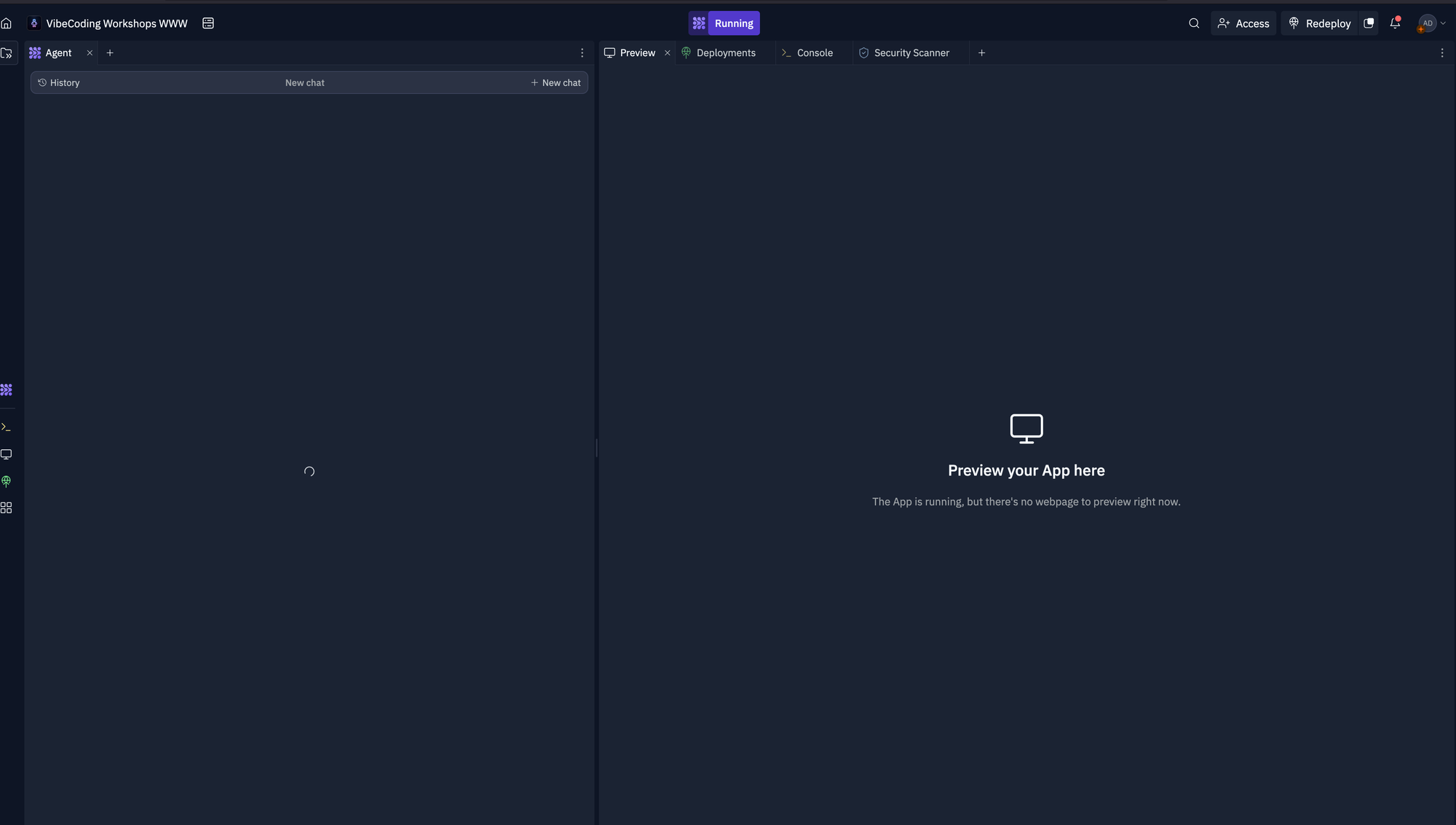
Google Veo: Video generation tool using the same three-zone layout approach
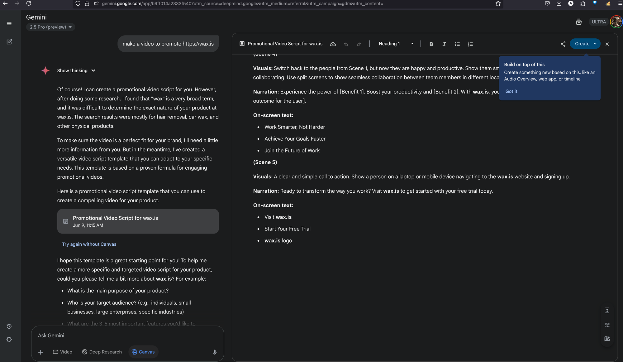
Perplexity: Research-focused AI with the same architectural choices
The Feedback Loop Innovation
One particularly interesting evolution is the "prompt feedback pane"—the area above the prompt input that shows AI processing, suggestions, or contextual information. This creates a direct feedback loop between user intent and AI understanding, making the interaction more transparent and controllable.
Why This Matters
This convergence suggests we're past the experimental phase of AI interface design and starting to settle into a first wave of conventions. The pattern has been tested across millions of users and diverse use cases, proving its effectiveness for human-AI collaboration.
For Designers:
This is becoming the expected interface language for AI tools. Deviation from this pattern may create unnecessary friction for users already trained on these interactions.
For Developers:
The standardization means established component libraries, user expectations, and interaction patterns that can accelerate development.
For Users:
Consistency across AI tools reduces cognitive load and makes new AI applications immediately intuitive.
The Broader Implications
This interface standardization mirrors what happened with mobile apps post-iPhone or web applications post-browser wars. We're witnessing the establishment of design conventions that will likely persist for years, shaping how humans interact with AI across all domains.
The pattern isn't just about aesthetics—it's optimized for the unique challenges of AI interaction: managing context, facilitating iterative refinement, integrating multiple modalities, and maintaining user agency in increasingly automated workflows.
As AI capabilities expand beyond text to include images, video, code, and multimodal interactions, this interface framework provides the flexibility to accommodate new features while maintaining familiar user patterns.
Bottom Line: The three-zone, prompt-centric, left-heavy interface design has become the de facto standard for AI tools because it fundamentally works better for human-AI collaboration than traditional software paradigms. This isn't just a trend—it's the foundation of how we'll interact with AI systems for the foreseeable future.
Member discussion